Color Grading is a technique that few outside the world of art and photography really understand, but which viewers will unknowingly appreciate. It is an essential finishing touch to any photograph and has the ability to dramatically affect mood and appearance. So what is it and how is it done?
After you have completed editing your image the last step might be to use color grading. Not all images need this additional step, but if yours lacks a certain warmth or depth of color, you might give it a whirl. The color grading option in Lightroom has three color wheels. One is for shadows, one is for midtones and one is for highlights. While one can color grade using all three at once (by clicking the pyramid of circles after the word “adjust” below), I recommend approaching the tones of your image separately.
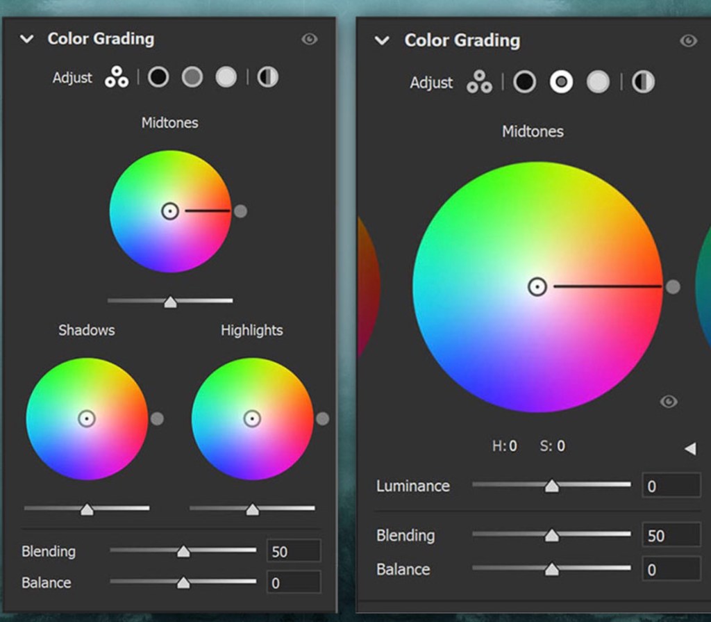
I often start with the highlights, especially if I have a lot of sky in the image. Dragging your cursor over the circles above, you will see the third is for highlights. If you wish to warm your image, you can choose colors in the upper right of the color wheel. Cooling the image requires color selections in the lower left. The further out from the center, the more extreme the color will be. I find the best results to be subtle, where a viewer would not know grading is used unless two images are captured side by side.
When you are satisfied with the tone of your highlights, move on to the shadows and the midtones. This is where the mystery really begins. Artists for centuries have known that complimentary colors are “pleasing” to the eye. At its basic, complimentary colors are red:green; yellow:purple; and orange:blue. In other words, since complimentary colors are across from one another on the color wheel, they will have both warm and cool tones. Together, this can create a vibrant contrast, making each other pop without being jarring to the eye.
Using color grading takes a lot of practice, but you will find that the right combinations of color tones (warm and cool) combined in the highlights and shadows of your images can really change the mood of your work.
There is also a less “artistic” but more practical reason to use color grading. Sometimes the colors of your images look great on a white wall, but your client has a colored wall. This is one of the great advantages of photography over painting – we can adjust our images to perfectly compliment the wall they are to be hung upon! For example, the image at the top of this blog entry was color graded using a greenish/purplish combination. However, I intended to hang it on a grey, wallpapered wall and I needed a much cooler tone. The same image is shown below with the only difference being the color grading. The result looks great on my wall!